Workflow Studio
When you're working on a new project of any kind, often, the first step will be to go to a whiteboard, where you will plan the workflow and identify the key steps on the way to your goal. If you're a data scientist, the workflow will usually include one or more of the following steps:
- Import data
- Prepare the data
- Build a model
- Validate the model
- Apply the model
In real-life applications, this workflow may be even more complex. Altair AI Cloud implements your whiteboard workflow in software via Workflow Studio.
The Default View
When a new workflow is created, the default view of Workflow Studio displays an empty canvas that can be filled with process-building elements.
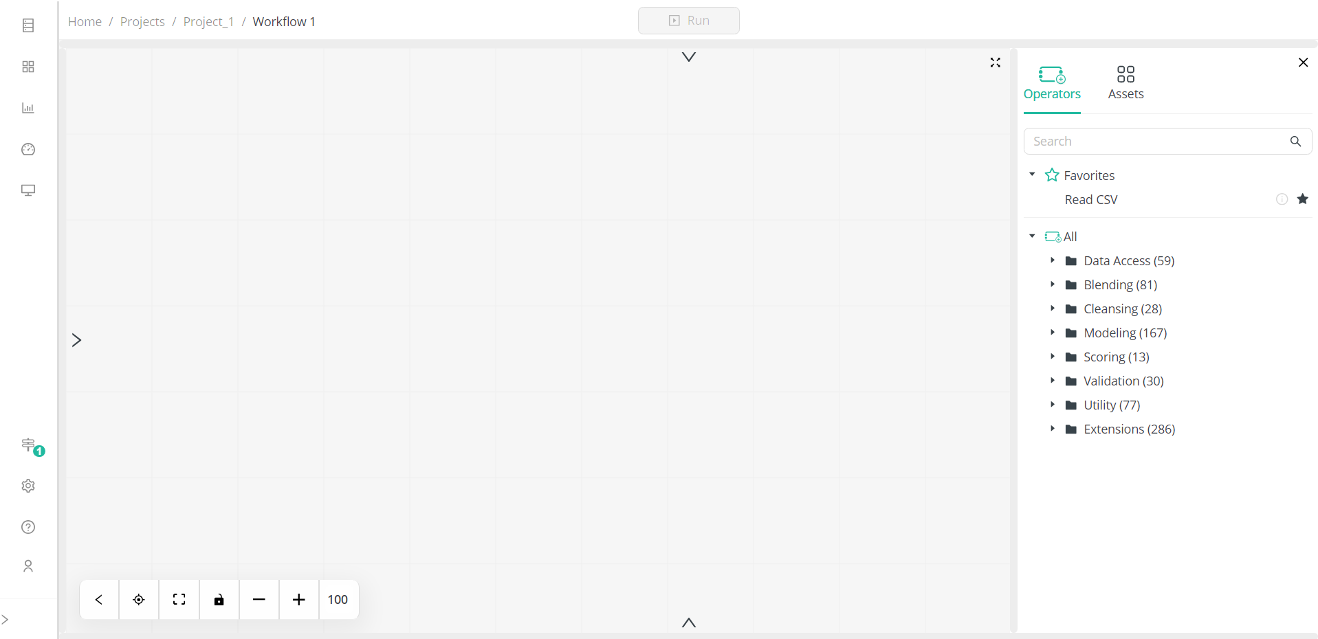
Workflow Studio includes several panels, some of which are hidden when you create a new workflow and can be displayed by selecting the corresponding display button, which looks like a chevron.
Each of these panels can be adjusted to handle different screen sizes and even completely resized to fit your screen but are fixed at specific locations. In this way, you’ll always know where to look for a specific panel. Each panel is also context aware, that is, for any panel or tab selected, only those actions that are valid for the selected panel or tab are shown. Some panels, such as the Workflow Configuration and Data View panels, can be resized to occupy the full size of your screen by clicking the Maximize ![]() icon, and closed by clicking the Close
icon, and closed by clicking the Close ![]() icon. These panels are described in detail below.
icon. These panels are described in detail below.
Process Building
All process-building elements are in a panel located right of the screen. This panel includes the tabs Operators and Assets. When an operator is added to Workflow Studio and selected, the tabs Operator Parameters and Help also display.
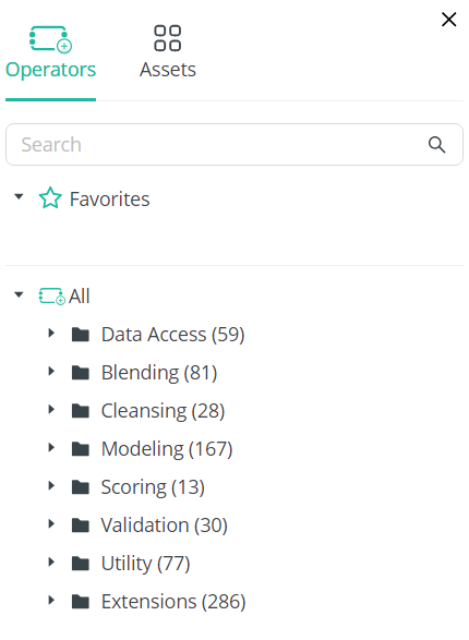
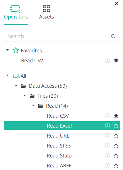
The Operators tab contains all the essential elements required to build your workflow; each operator is categorized according to its function. You can search for specific operators by typing their names in the Search bar. You can also add those operators you use most often to your Favorites list by selecting the operator and clicking the Favorites ![]() icon to its right.
icon to its right.
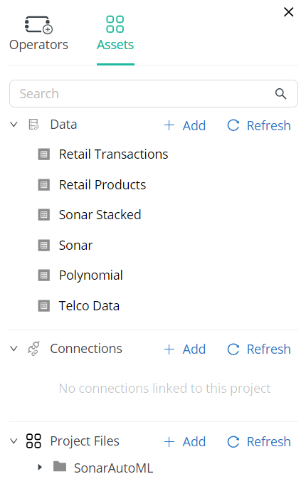
The Assets tab includes a list of all files and connections you have added to your AI Cloud instance.
The Parameters tab contains the properties relevant to a selected operator. For example, if an Input operator is added to the workflow, the properties related to this operator, such as its type, location, and file name, are displayed in the tab. For in-database operators, an expression editor is made available for better formula editing.
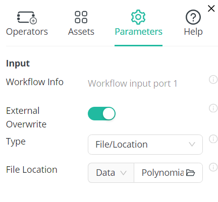
The Help tab displays detailed information of a selected operator, including its synopsis, description, input, output, and parameters.
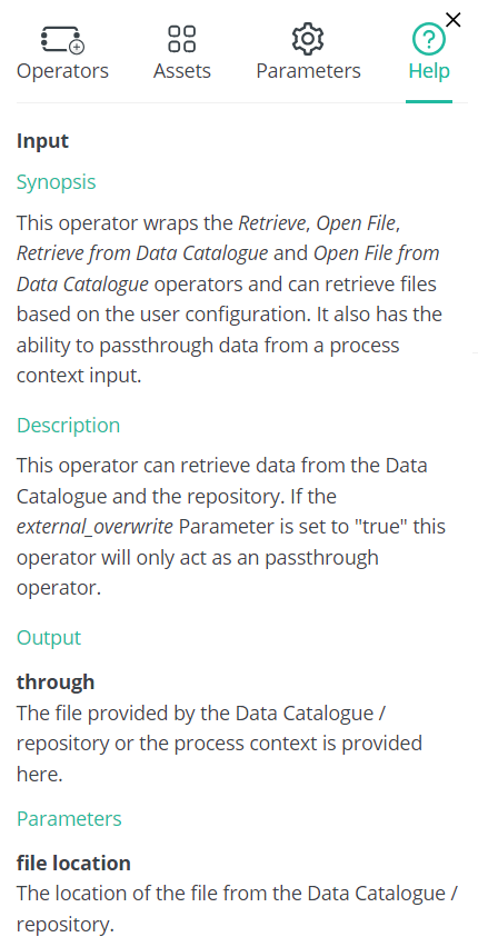
The Parameters and Help tabs are always linked to an operator and only appear when one is selected on the canvas.
Design View
The Design View serves as your canvas and is where the majority of your workflow design process takes place.
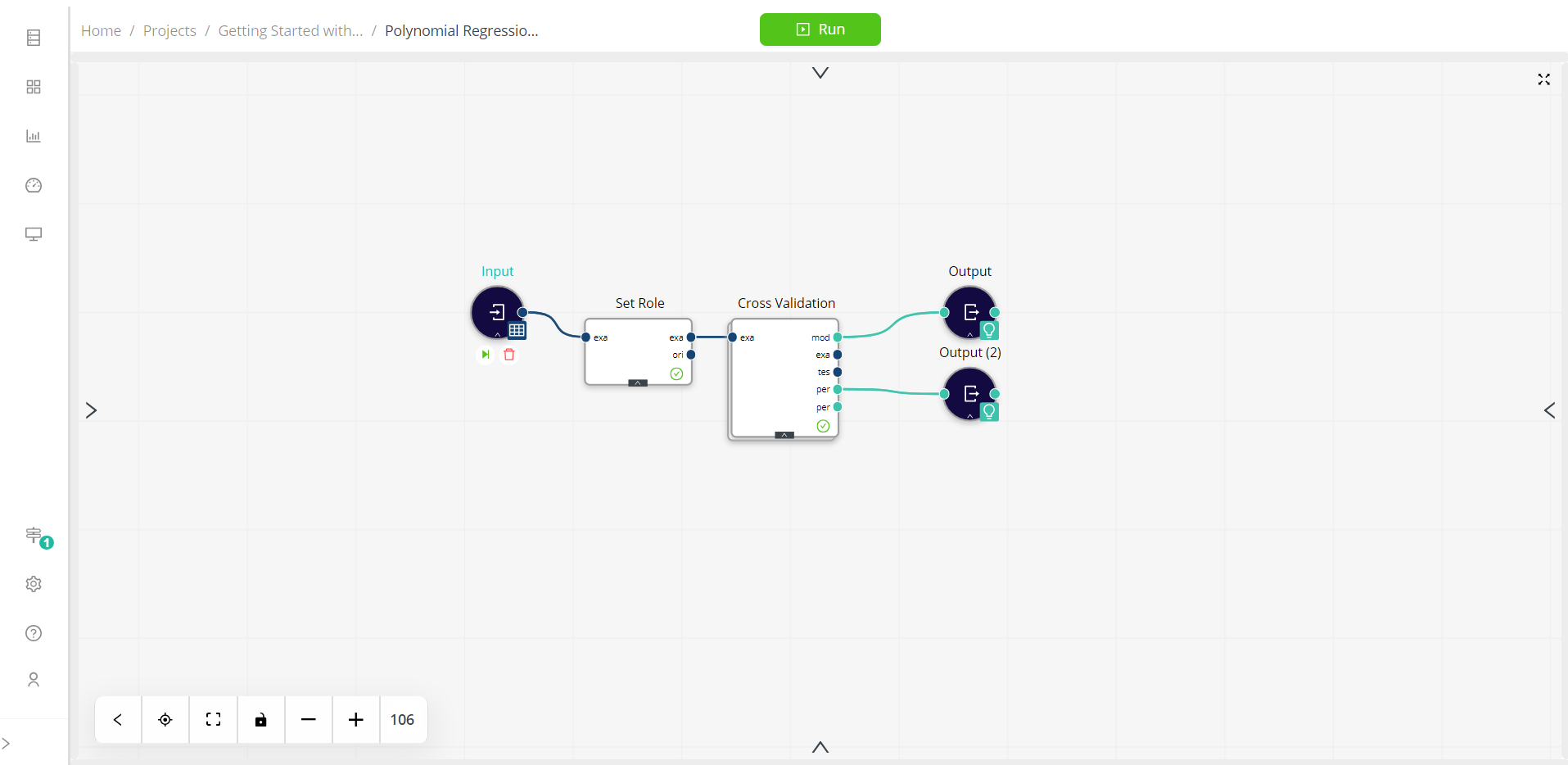
The elements added to the Design View can be resized simultaneously by clicking the controls located at the bottom of the screen. You can also use your mouse to enlarge or shrink these elements.
Process Navigation
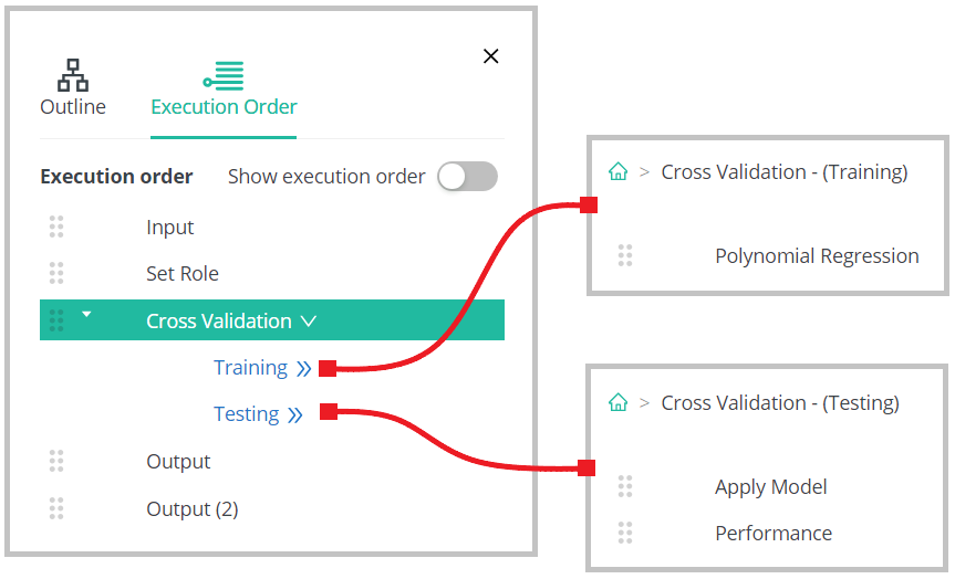
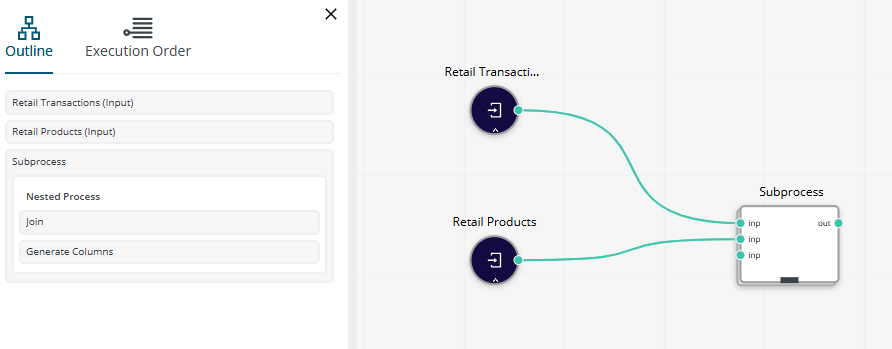
Process Navigation controls are found left of the screen. When displayed, the panel shows the tabs Outline and Execution Order.
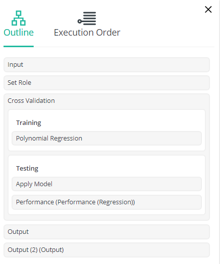
The Outline tab provides you with an overview of the operators that make up your workflow. Selecting an operator from this tab brings this operator into focus in the middle of the screen and displays its parameters at the right side of the screen.
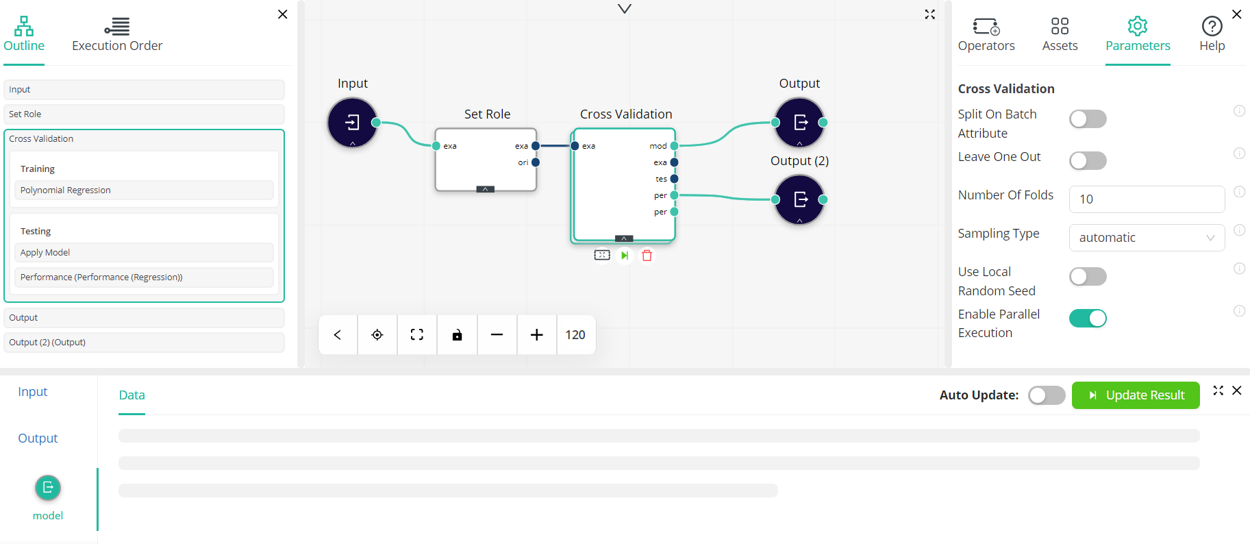
The Execution Order tab presents the order in which operators were added to your workflow. When the Show execution order button is toggled, each of the operators added to your workflow are numbered and dashed lines appear on the screen to indicate how each step of the process is executed.
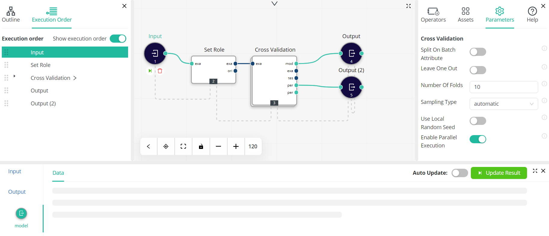
Nested processes can easily be located and viewed.
Data View
When a process has been run, a view of the data contained in the project, both inputs and outputs, displays at the bottom of the screen. This panel will also enable you to define charts and view statistics. Processes can be run by clicking the Run button at the top of the screen.
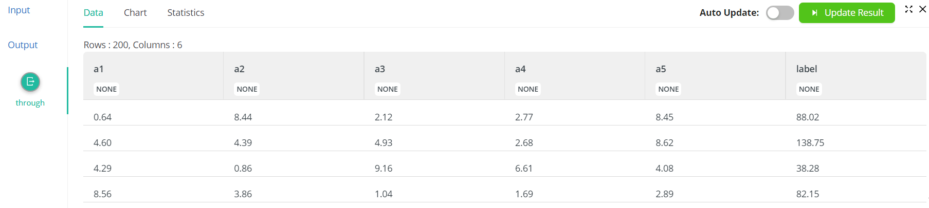
The data panel displays data corresponding to operator selection and shows values only when an operator is selected. In the following screenshots, the data columns clearly change depending on the operator selected on the canvas.
Note that when Auto Update is enabled, the results in the data panel are computed even when an operator with invalidated results is selected or when a workflow is loaded for the first time.
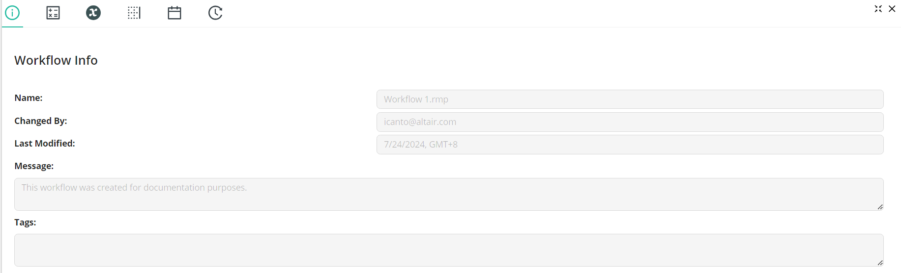
Workflow Configuration
Information related to the workflow and its context, variables, log, project, and version history is found at the top of the screen. This panel is usually hidden and can be displayed by clicking the Show ![]() icon. The different types of information available in this panel can be viewed by clicking the corresponding icons located at the top left.
icon. The different types of information available in this panel can be viewed by clicking the corresponding icons located at the top left.
Working with Workflow Studio
A workflow is created by dragging and dropping various operators into the Design View and then connecting them via ports.
When added to the Design View, all operators are assigned default names, such as Input, Input (2), etc., in the order in which they are added. You can rename operators by clicking on their name, replacing the default name with one you prefer, and pressing Enter on your keyboard or clicking elsewhere on the screen.
In most cases, operators will have at least two ports, which are identified as colored circles to the left and right of each operator. That on the left serves as an input to the operator, while that on the right serves as an output. When an operator is added to the Design View, it is automatically connected to the input closest to it. In addition, clicking on the port of an operator in the canvas results in a new action in the Operator panel that allows you to select and insert another operator of choice and directly connect it to the operator on the canvas.
When two operators are connected, the output of the first will serve as an input to the second. A connected set of operators that help you to transform and analyze your data is called a process.
Manipulating Design Elements
Any element added to the Design View can be deleted by selecting it and then clicking the Delete ![]() icon or pressing Delete on your keyboard. If a connected operator is deleted, all connections to this operator are also deleted.
icon or pressing Delete on your keyboard. If a connected operator is deleted, all connections to this operator are also deleted.
Connections can be deleted by hovering your mouse over it and then clicking Delete Connection ![]() .
.
You can undo / redo any action:
- To undo a previous action, press Ctrl + Z / Cmd + Z on your keyboard.
- To redo an action, press Ctrl + Y / Cmd + Y (Ctrl+Shift + Z / Cmd+Shift + Z).
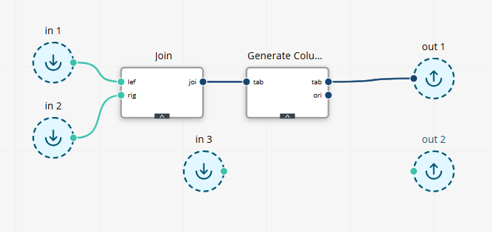
When operators are nested in a subprocess, as in the following example:
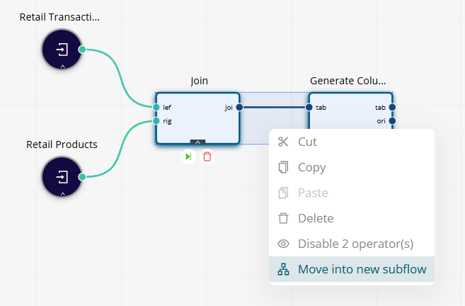
double-clicking on this subprocess directly navigates into the operators that comprise it.
Creating Workflows
Let’s create a simple workflow to better understand how to work with Workflow Studio.
Suppose we have two separate reports, one containing a list of products and their prices (Retail Products) and the other containing a list of products and their quantities purchased by various customers over a month (Retail Transactions), and we wish to combine them to obtain a single report that describes the total amount (value) of all transactions for these products. We can reasonably assume that not all products had been purchased at the time the report Retail Transactions was generated. We can break down the steps required to combine these reports and generate the required information as follows:
- Import each report.
- Join the two reports.
- Add a Total column to the final report.
- Generate the report.
Now, let’s create the workflow.
Import Each Report
- In Workflow Studio, expand the Assets tab and drag and drop
Retail Productsinto the Design View. - Rename this input as
Retail Products. - Repeat Step 1 to add the data file
Retail Transactionsto the Design View. - Rename this input as
Retail Transactions.
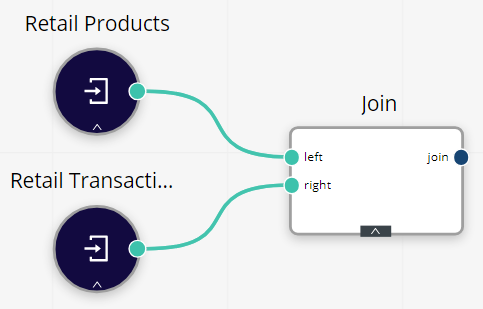
Join the Two Reports
-
In the Search bar of the Operators tab, type in
Join. Drag and drop this operator into the Design View, close to Retail Products. The output port of this operator automatically connects to one input port of the Join operator. -
Select the output port of Retail Transactions, drag your mouse to the remaining input port of the Join operator, and then release.
-
In the Parameters tab of the Join operator, write
Product IDfor both left key attribute and right key attribute.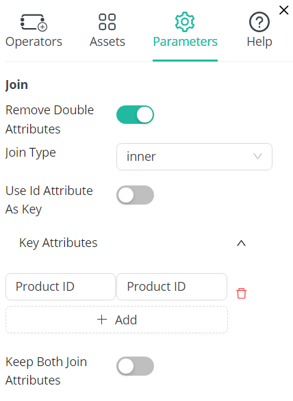
Add a Total Column to the Final Report
- In the Search bar of the Operators tab, type in
Generate Columns. Drag and drop this operator into the Design View. - Connect the output port of the Join operator to the input port of the Generate Columns operator.
- In the Parameters tab of the Generate Columns operator, enter
Totalin the column name field andAmount*Pricein the function expression field.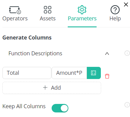
Generate the Report
-
Expand the Operators tab and drag and drop the Output operator into the Design View.
-
Connect the table output port of the Generate Columns operator to the input port of the Output operator.
-
In the Parameters tab of the Output operator, enable both Display Result and Save Results.
-
Enter
Sales Todayin the File Location field.Your workflow should now look as follows.
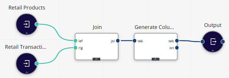
-
Run the process by clicking the Run button at the top of the screen.
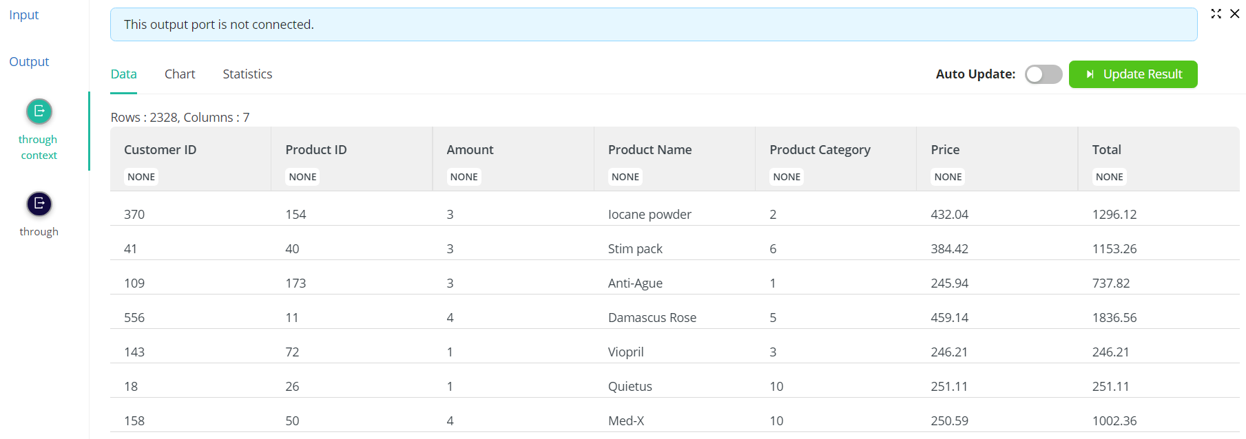
When the Data View panel is expanded, the following report displays.
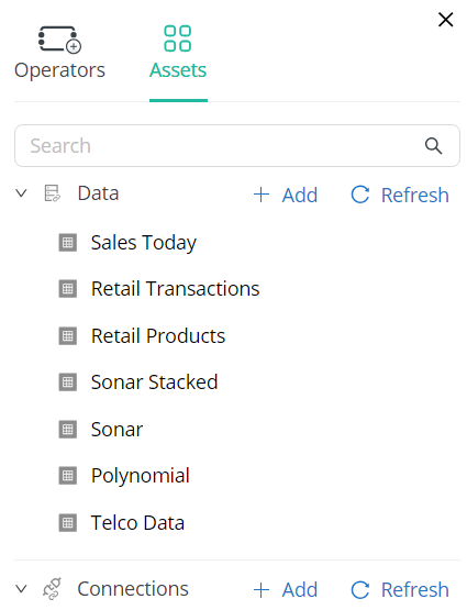
When the Assets tab is selected, Sales Today displays under Data.
This file is saved in the rmhd5table format.
Understanding the Process
Let's discuss the process above to better understand how the process was built and how AI Cloud elements can be manipulated.
-
All processes will start with a data input. The Input operator has no input ports and a single output port. This output port should be connected to another operator to tell AI Cloud what to do with it. In our example, the Input operator could be directly connected to another operator because it is in the rmhd5table format. If your data file is a CSV file, for example, you will need to add the operator Read CSV and connect the Input operator to it before the file can be processed. Altair AI Cloud supports 14 different file types, including CSV, Microsoft Excel, URL, Microsoft Access, SPSS, etc.
-
Renaming operators will help you remember what the operator is used for, especially if you use multiple instances of the same operator (e.g., the Input operator) in a single workflow.
-
Typing in the name of an operator into the Search field in the Operators tab is a quick way to locate this operator, especially if you are unsure about where in the different Operator categories it might reside.
-
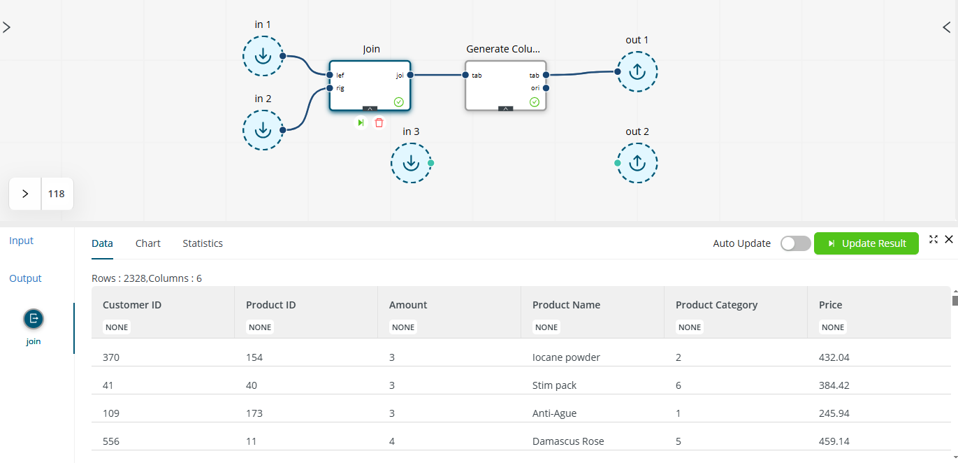
The Join operator combines two different tables into a single table via a key attribute. Thus, this operator has two input ports, one for each table to be combined. If you wish to join three tables, your process will have to include three Input connectors and two Join connectors, with the output of the first Join connector connected to the input port of the second Join connector.
-
In the example above, we selected the join type inner because we only want those records from both tables for which the key attributes match. You can select left, right, or outer as other join types.
-
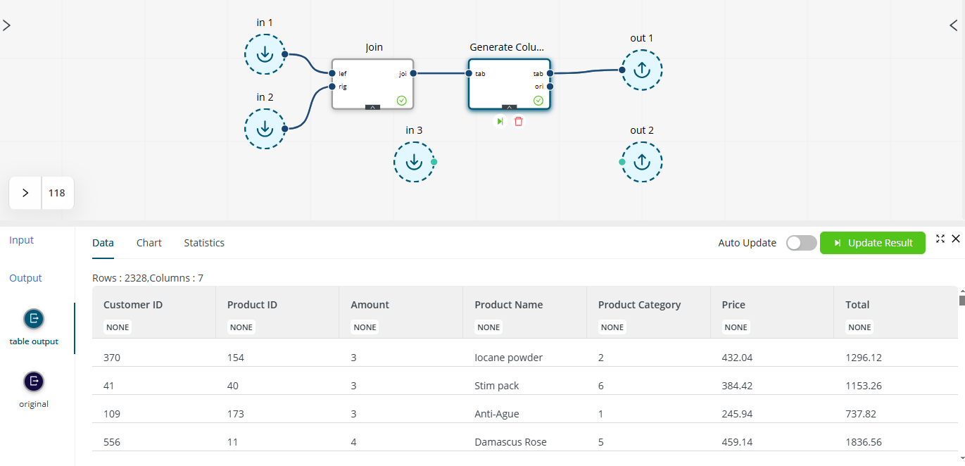
We connected the table output port to the input port of the Output operator because we want the newly generated column to be included in the final report. If the original output port is connected instead, the original joined table without the
Totalcolumn is passed to the Output connector. -
Before we generated the final report, we enabled the options Display Result and Save Results. The first option instructs Altair AI Cloud to display the results in the Data View panel, while the second instructs it to save the report as a new table, ready for use in another process if necessary.
-
Each operator can be run independently of the other operators by selecting the operator and clicking the Run
 button that displays below it. For example, in the process above, if only the Join connector is run, the resulting table will not include a
 Totalcolumn because the operator used to add the this column appears after the join.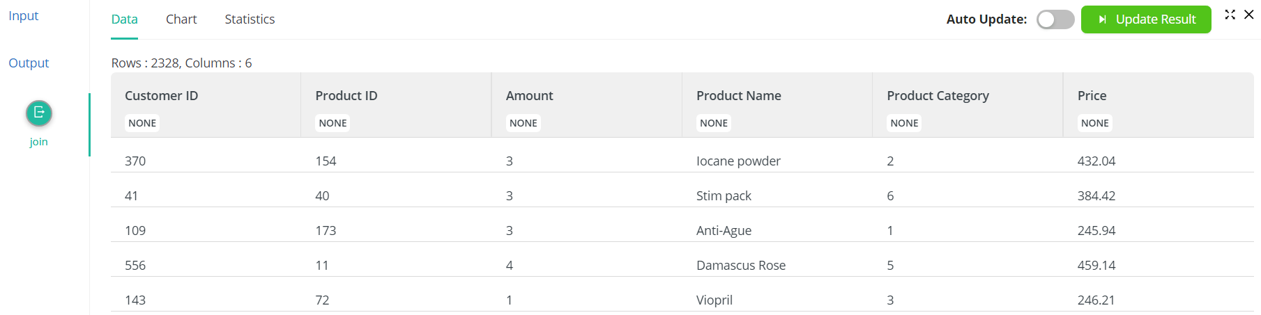
If, instead, the Generate Columns operator is run, the resulting table will include the
Totalcolumn.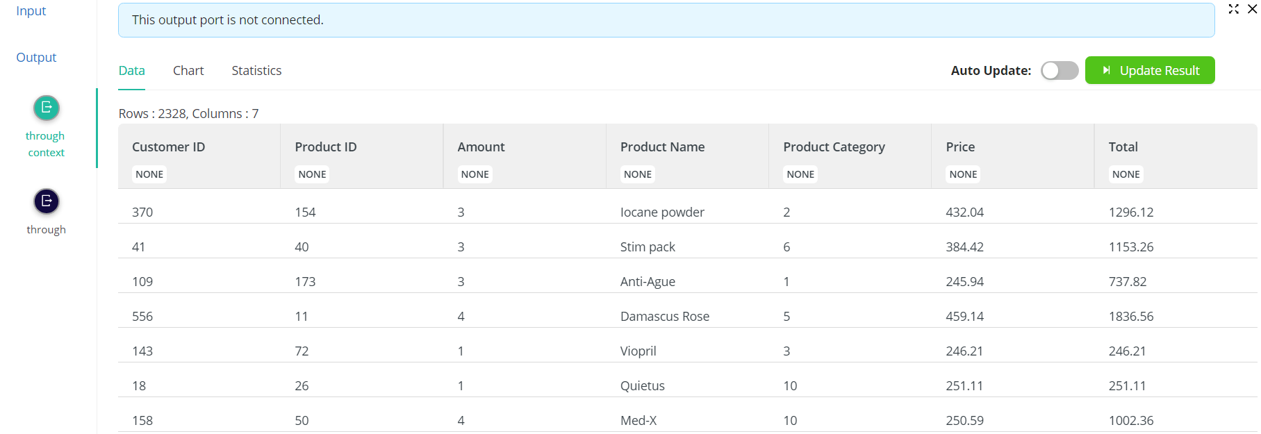
What's Next?
Now that we have a report that totals all transactions for various products sold over a month, what's next? If we are the business owner, we'll probably want to know which products types (categories) sell the most. This information will:
- tell us what types of products should be ordered in greater quantities to ensure that they are always on hand,
- guide store-organization decisions to ensure accessibility and visibility, and
- help identify which products should be promoted better to increase sales or, conversely, phased out.
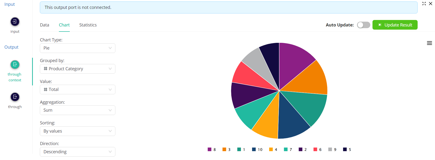
A chart is a great way to obtain a high-level view of our products and their selling performance. Let's create one now.
- Assuming you have the report generated from the example above, in Data View, click
Charts. - Select
Pieas the Chart Type. - Select
Product Categoryas the Grouped by parameter. - Select
Totalas the Value parameter. - Select
Sumas the Aggregation parameter.
The Chart View displays the following:
Hovering over each slice of the chart displays the product category, in this example 8, and the total amount of products in this category sold, in this example 248,656.
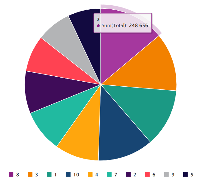
The smallest slice in the chart is occupied by products with category 5 and total sales 125,189.
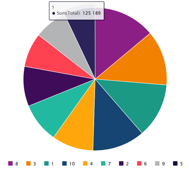
If we know that category 8 comprises food products and food items are not currently on display near the door for customers to see as soon as they step into our store, we may want to think about moving these items closer to where customers can see them. Similarly, if category 5 comprises household items and the chart indicates that they aren't selling as fast as, say, automotive supplies, we may want to rethink whether stocking them is even necessary or whether we should implement a promotion or discount to improve sales.